Oniria is a boutique travel agency specialising in tailor-made honeymoons, designed for travellers who prefer to stay far from the usual tourist trails.
The founding team came from the wedding industry and knew their audience inside out, with a proven product and their first couples booked before having anything set up. What they didn't have was a brand up to the level of that opportunity. No final name, no identity, no website.

ANUARIA 2025 Selection:
ANUARIA Award for Best Logo or Brand
The challenge
Building from scratch a brand capable of competing in one of the most visually saturated categories that exists, where anyone today can produce a spectacular image without leaving their home. And doing so from the ground up, starting with the brand's own name. With the condition that all the work would keep the door open to potential iterations in the business.

Our work
Before defining or creating anything, we agreed with them on what they were not going to be. This meant giving up the most overused visual elements and choosing an aesthetic that would differentiate them from their competitors. That agreement ended up becoming the filter that governs all of their communication today on a visual, verbal, and attitudinal level: not to be a cheesy brand.
For the name, we evaluated six candidates against eight criteria. Oniria won, which derives from 'onírico' (oneiric/dreamlike) and evokes the dream trip made a reality. It works in both Spanish and English and does not pigeonhole the company in the honeymoon category.
The exploration phase gave us the key brand idea. The insights did not talk about destinations, they talked about fears. The fear of going on your own to a distant country, of something going wrong when there is only one wedding in a lifetime, or of the honeymoon ending up as just another task in the wedding planning. If the process is experienced as a chore, the brand's job is to turn it into the first part of the trip. Two partners designing their trip accompanied by Oniria from the very beginning. With assistance before, during, and after the trip, and a series of unique rituals that an agency rarely offers.
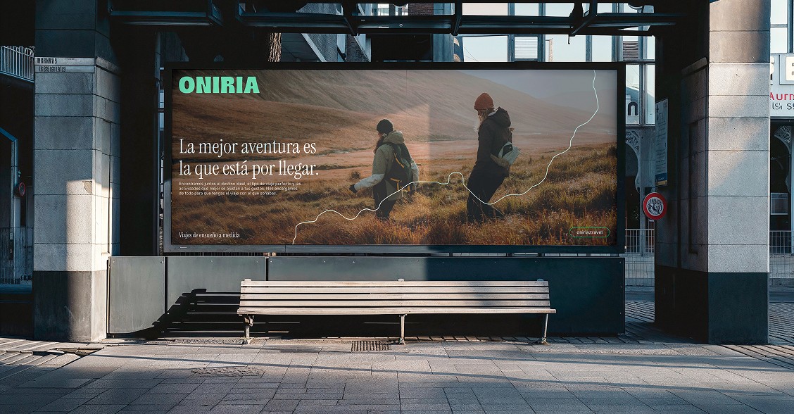
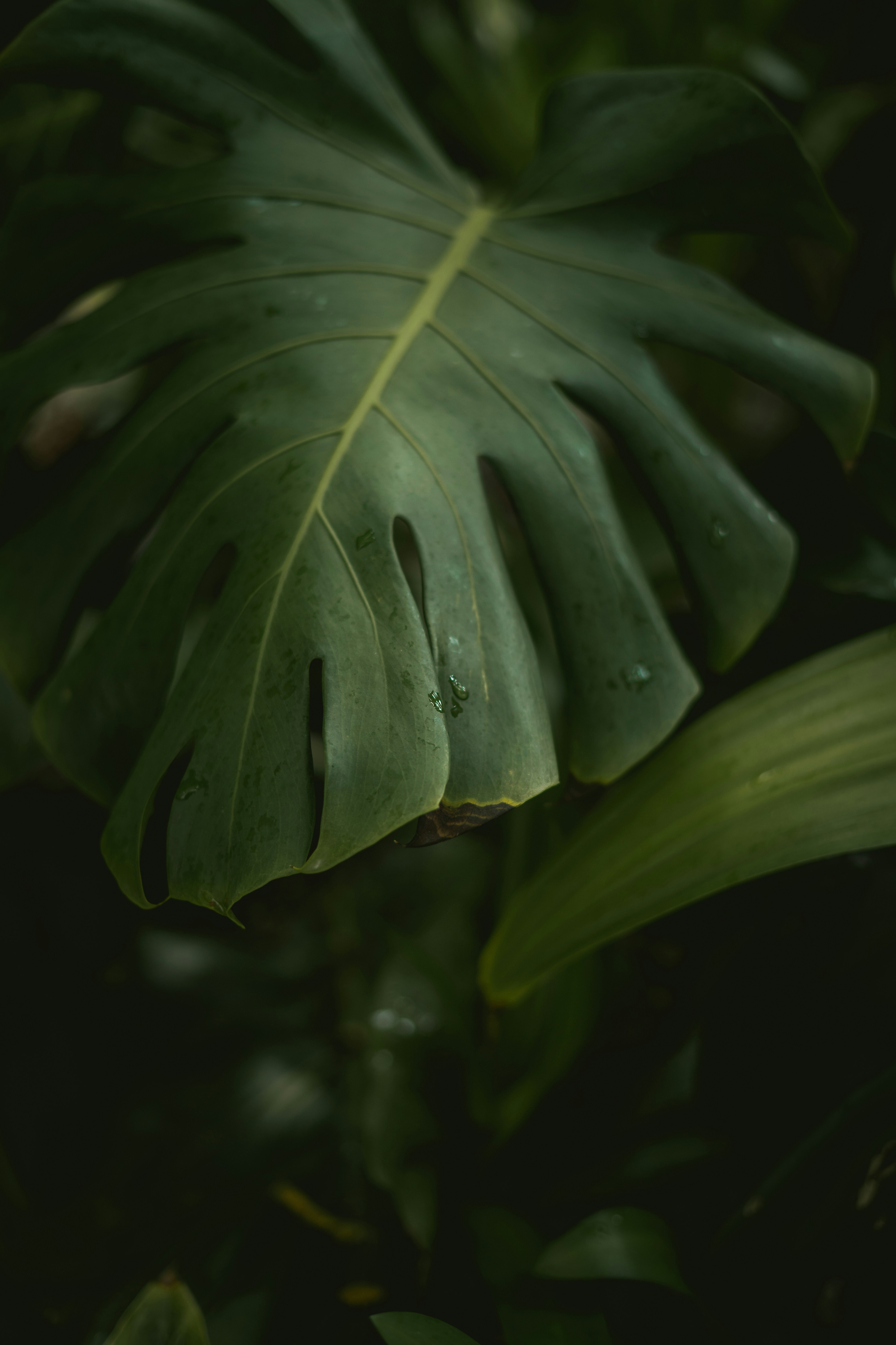
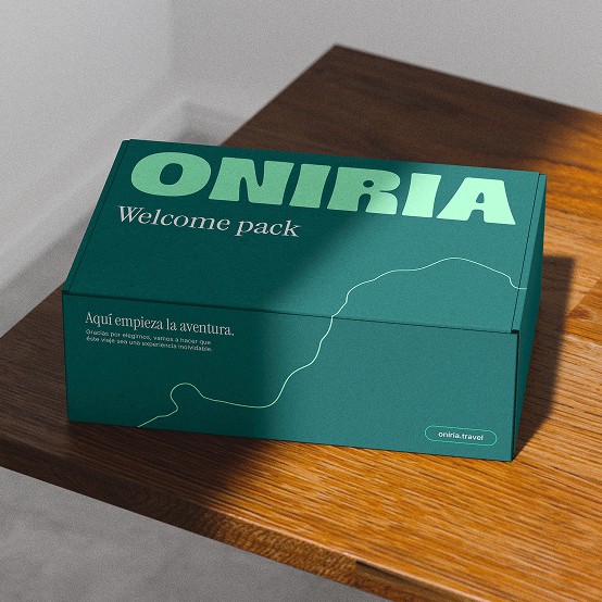
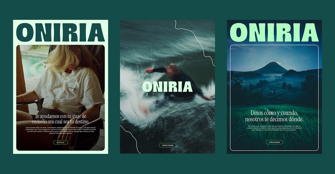
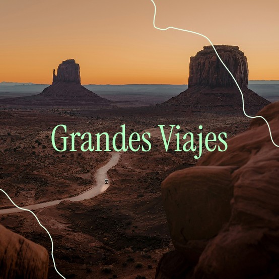
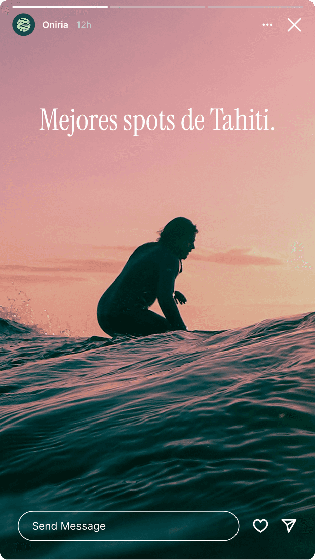
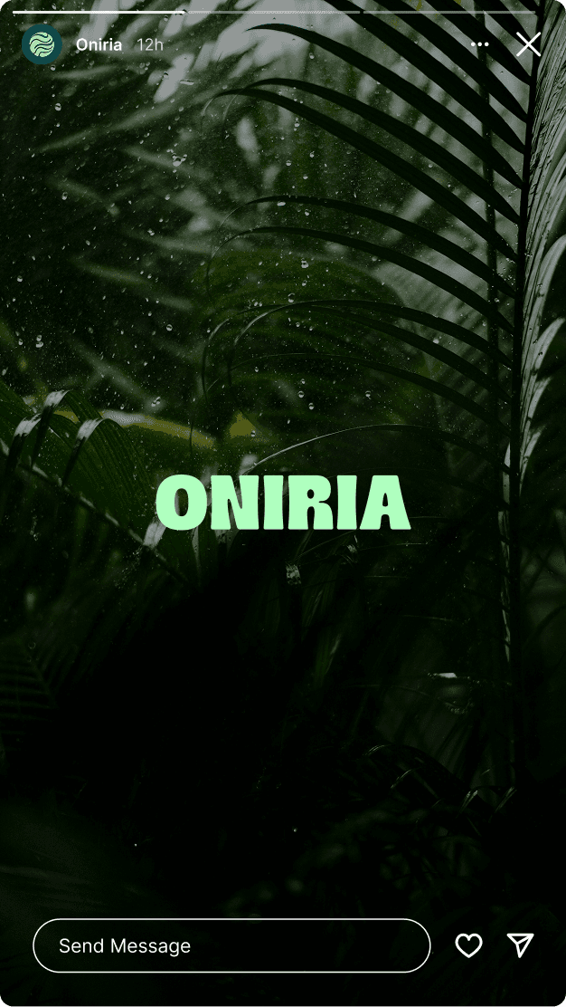
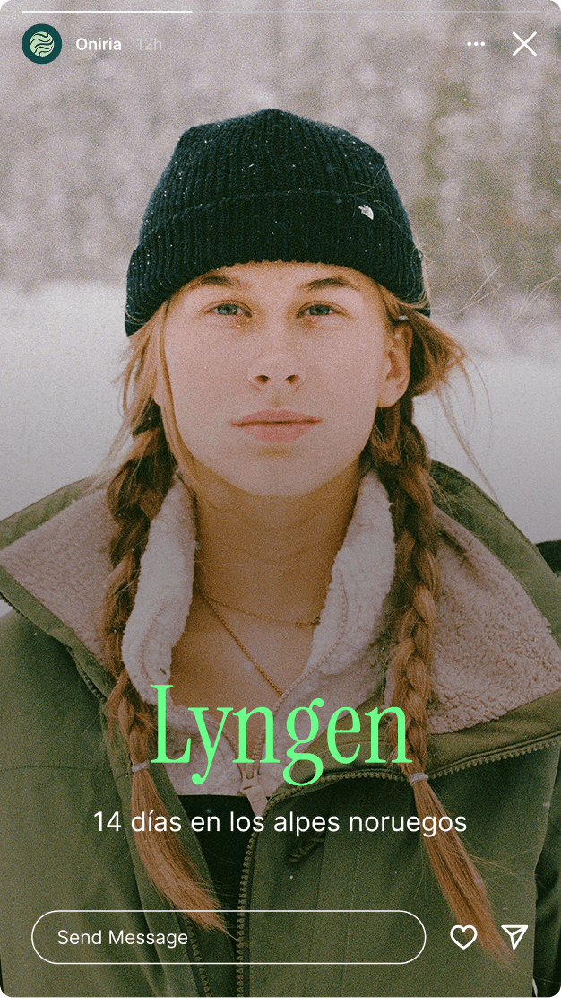
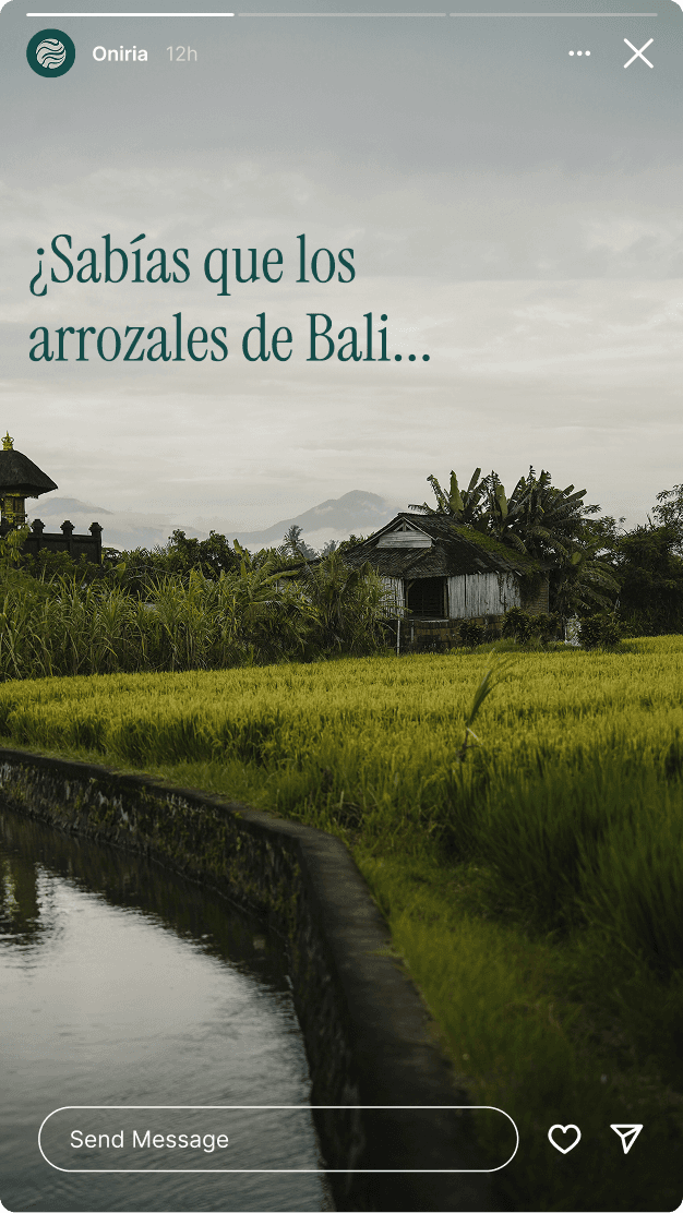
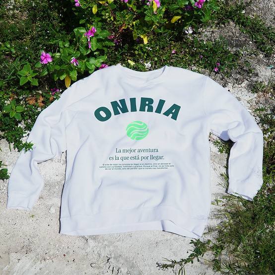
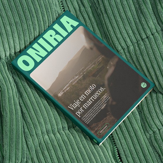
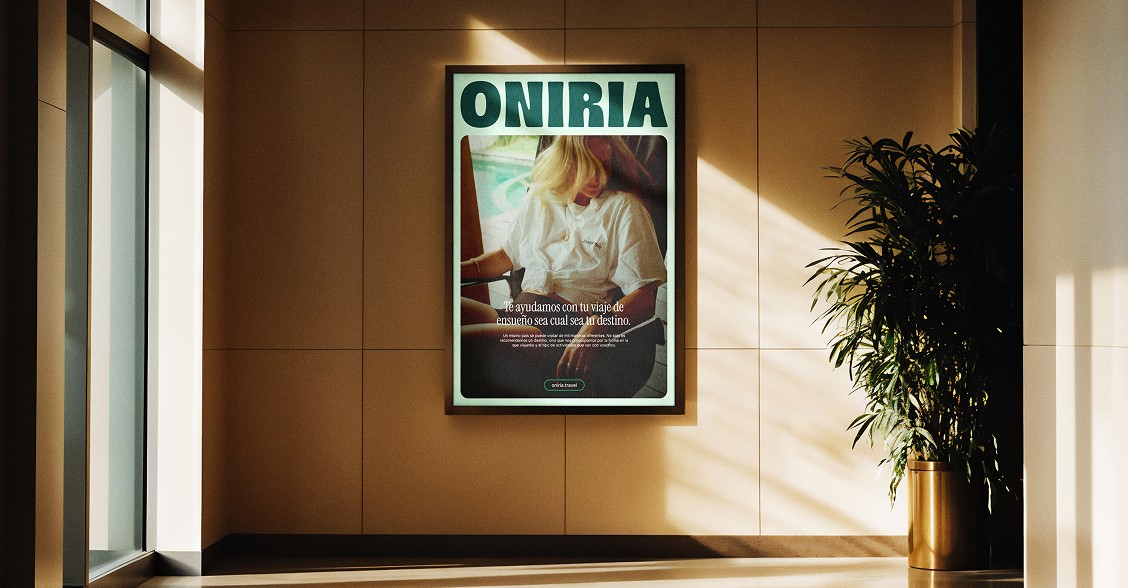
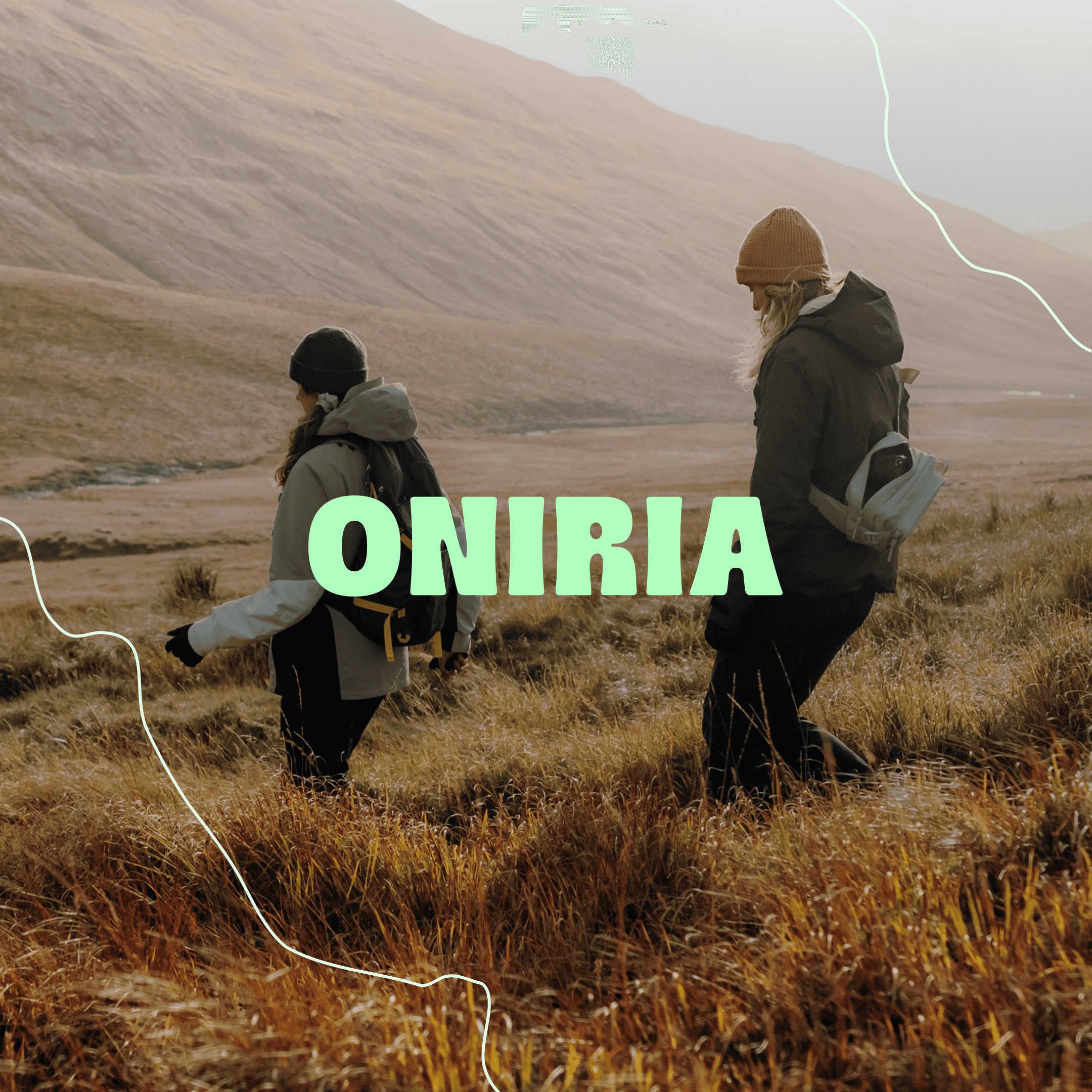
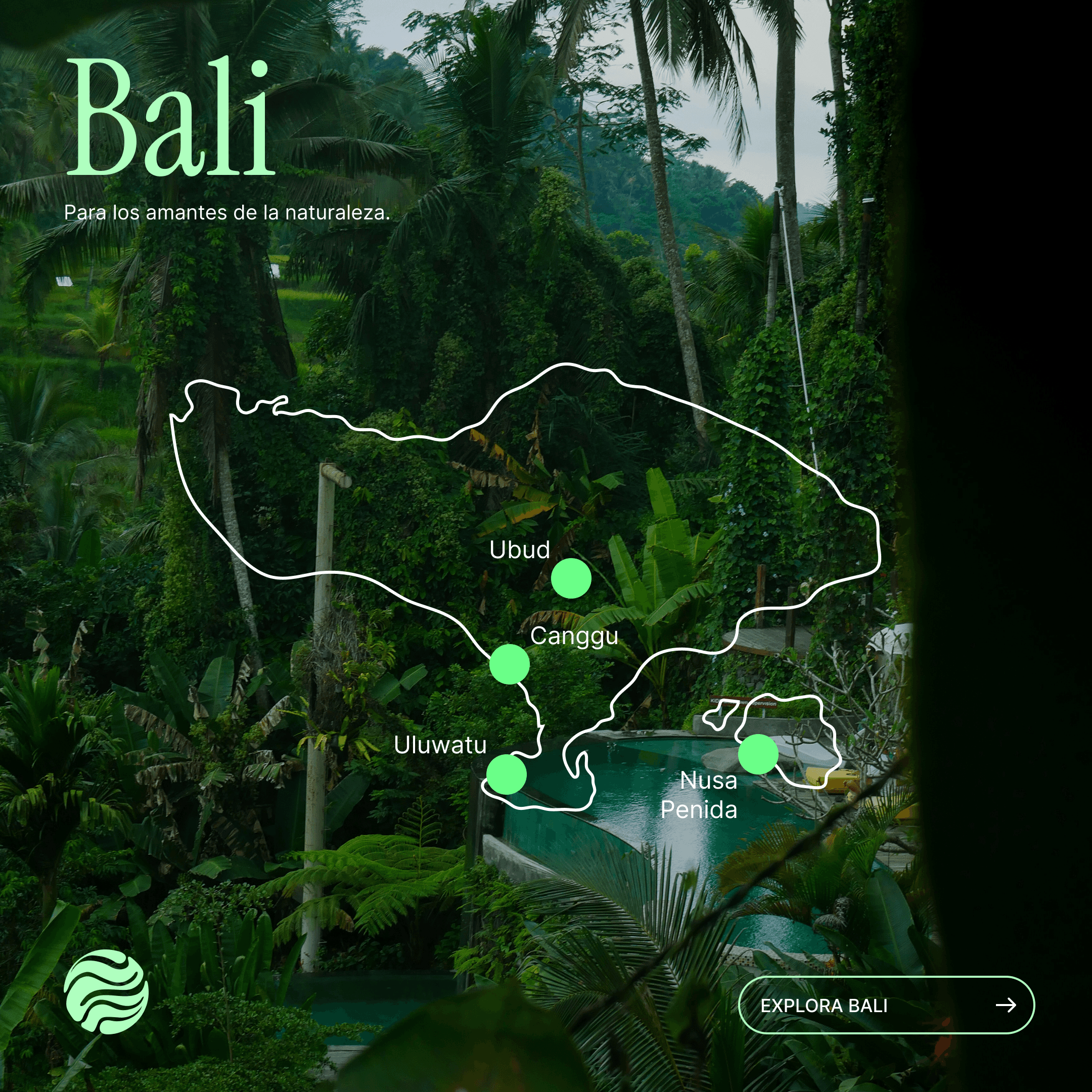
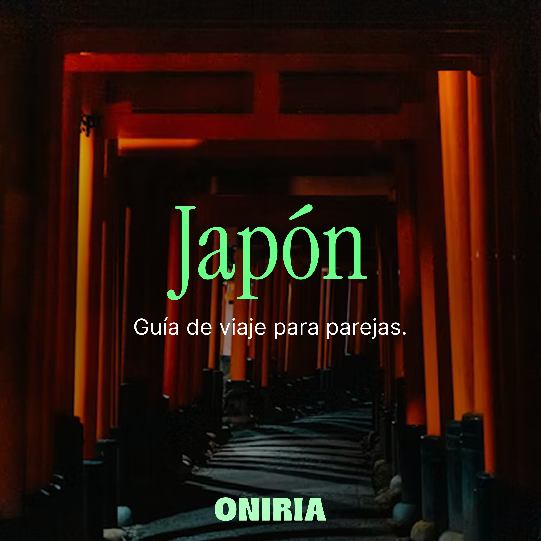
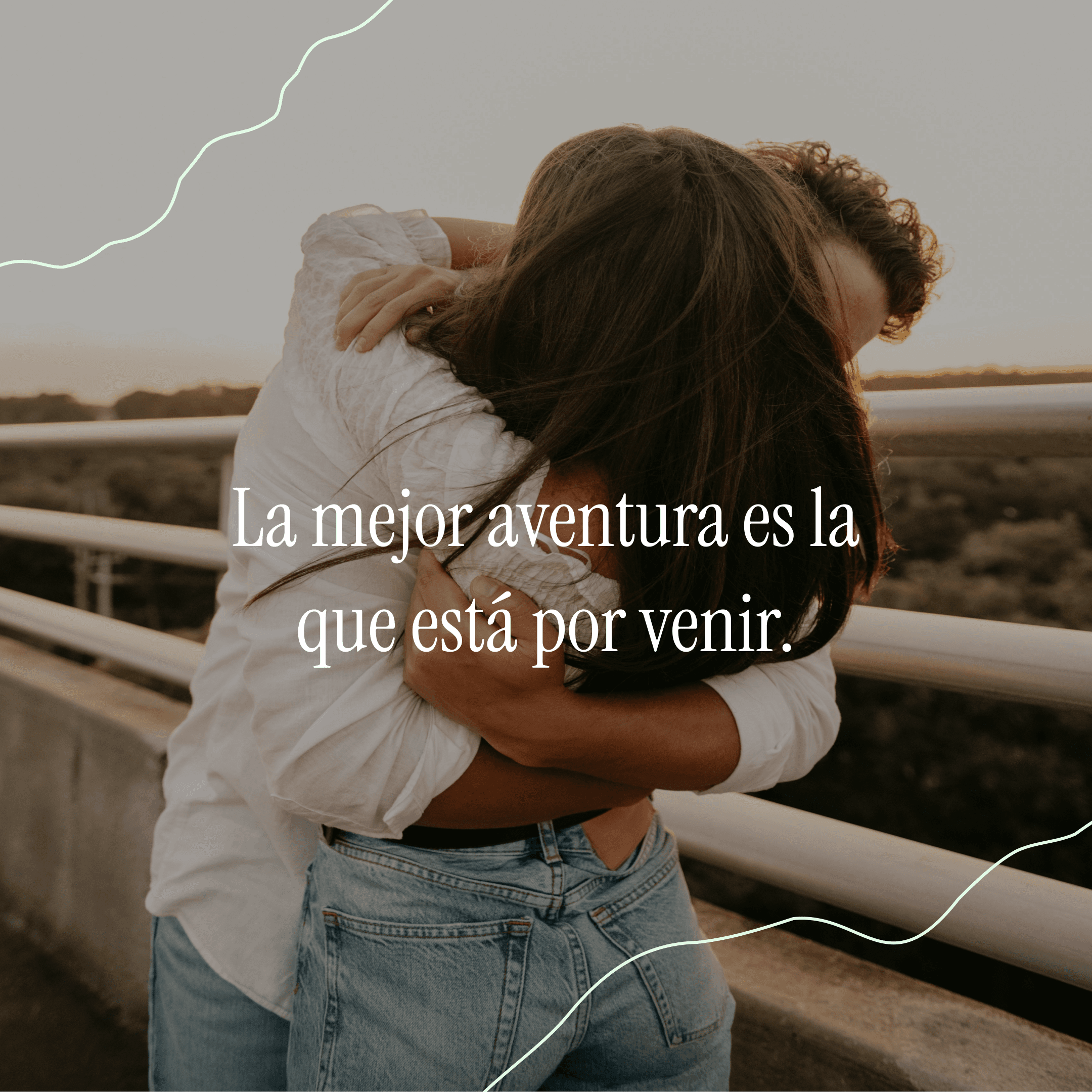
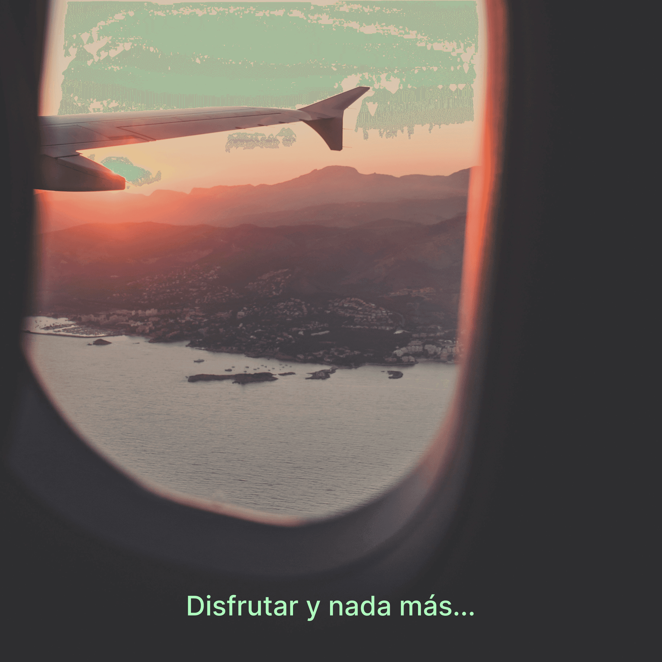
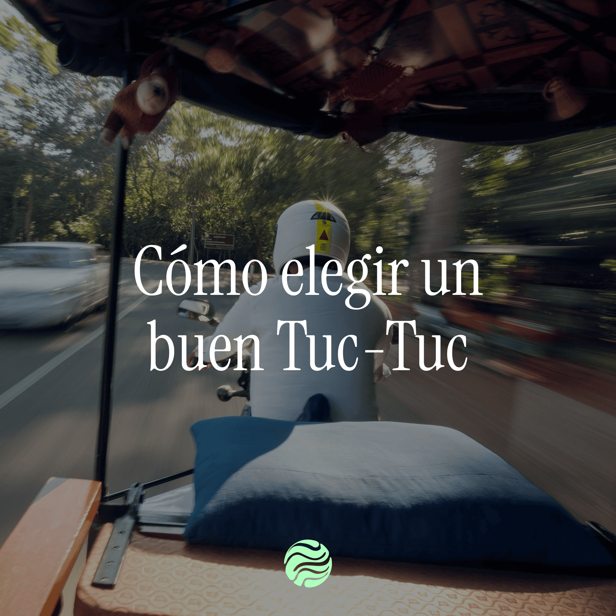
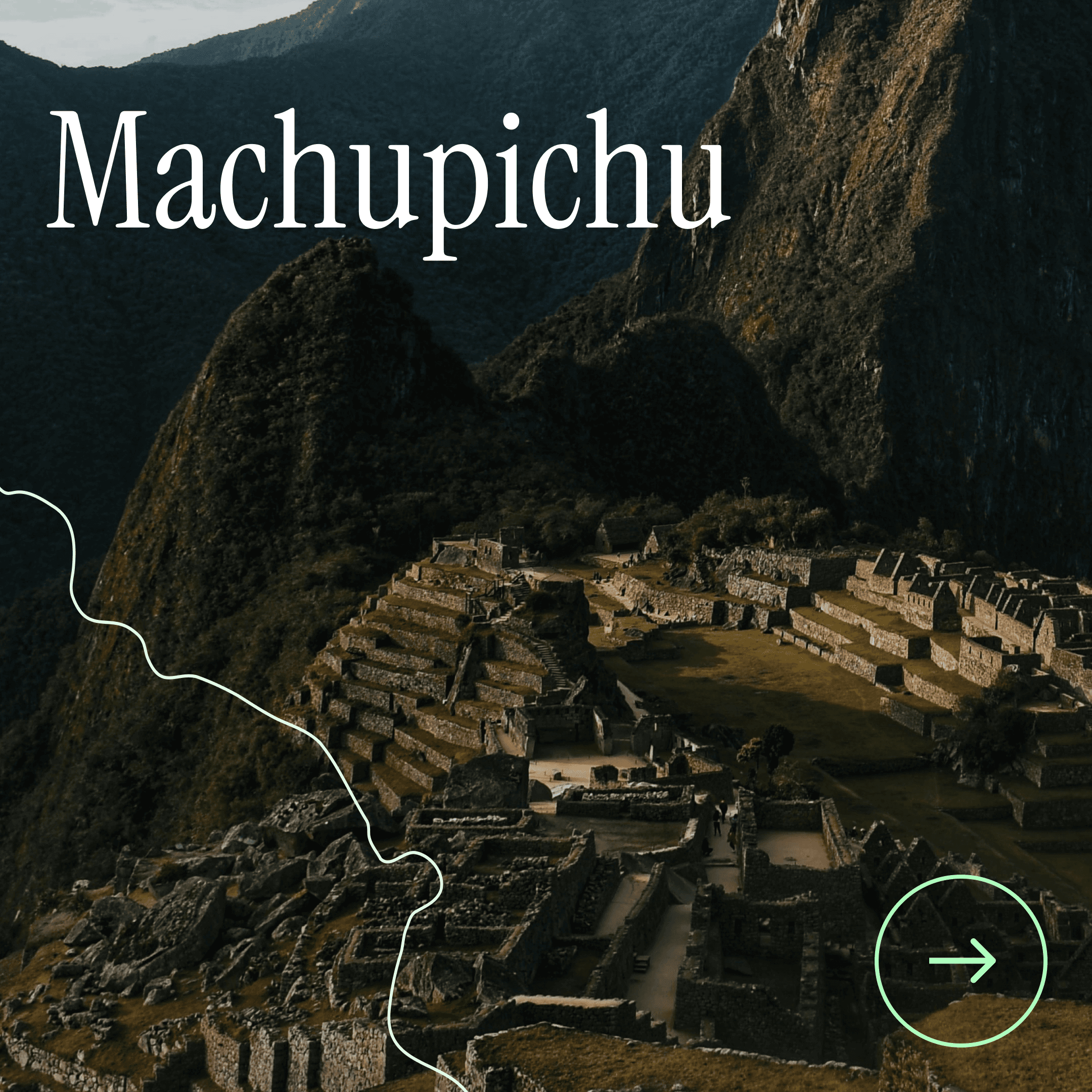
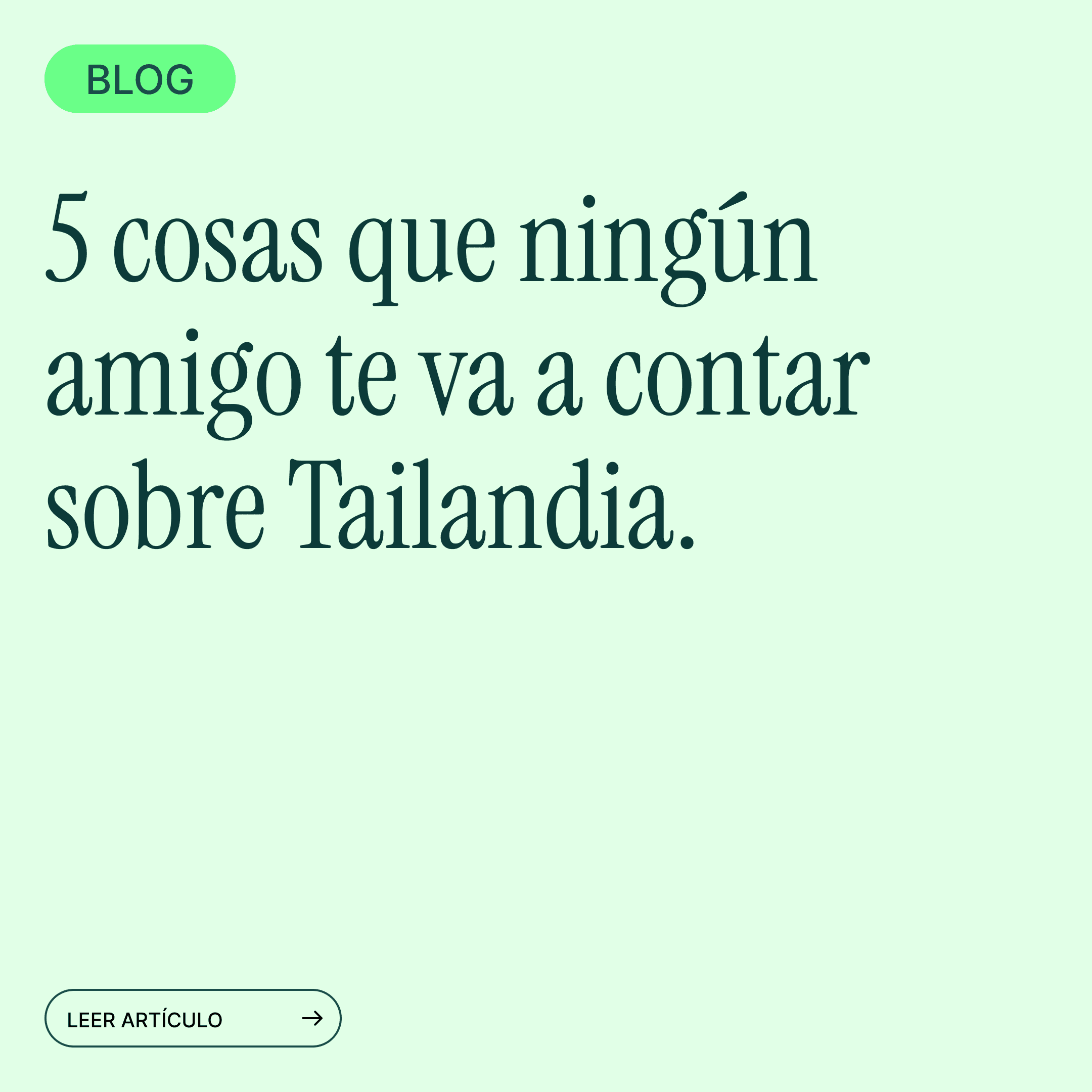
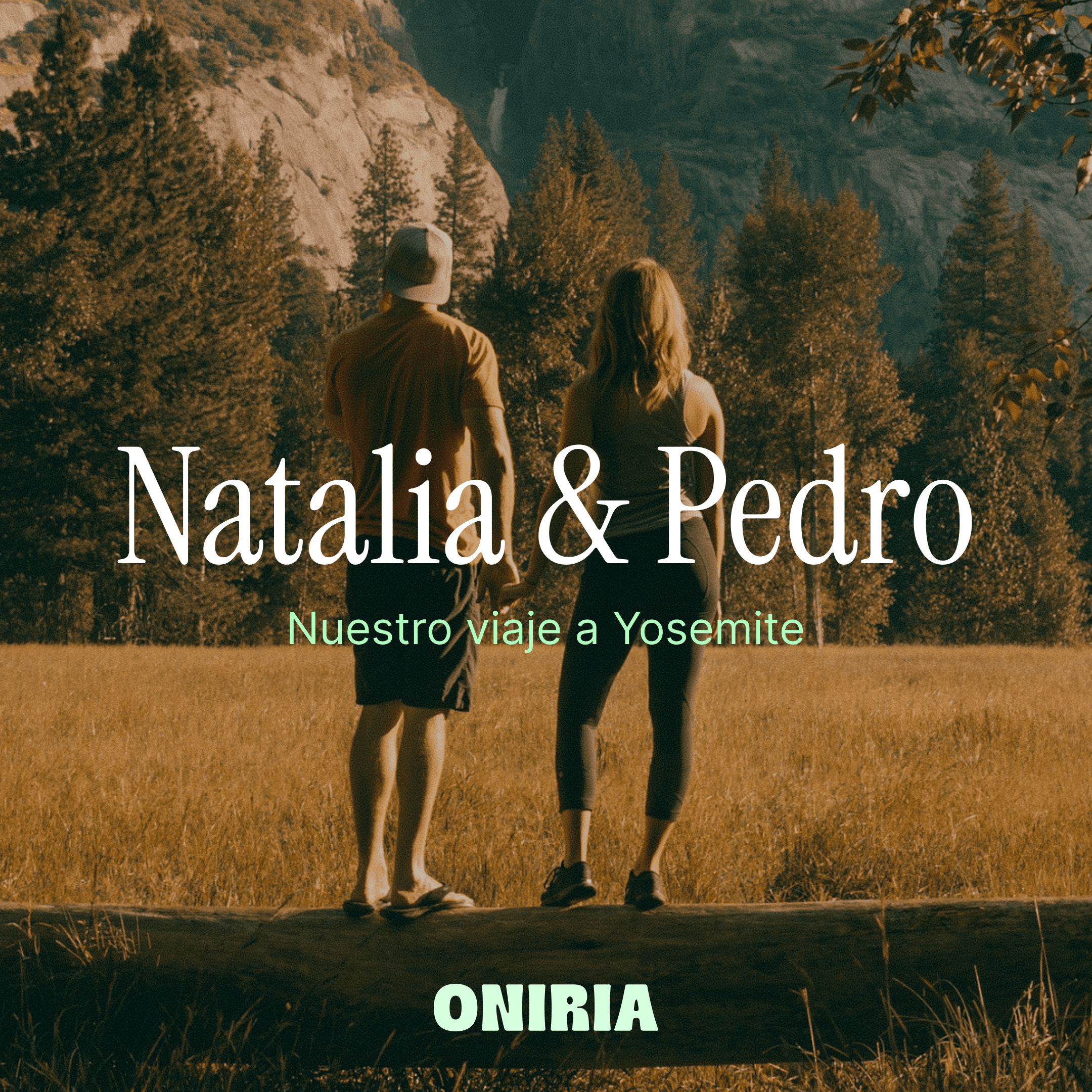
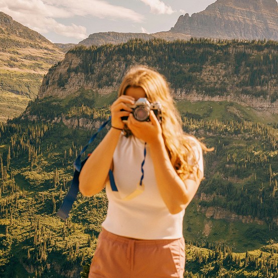
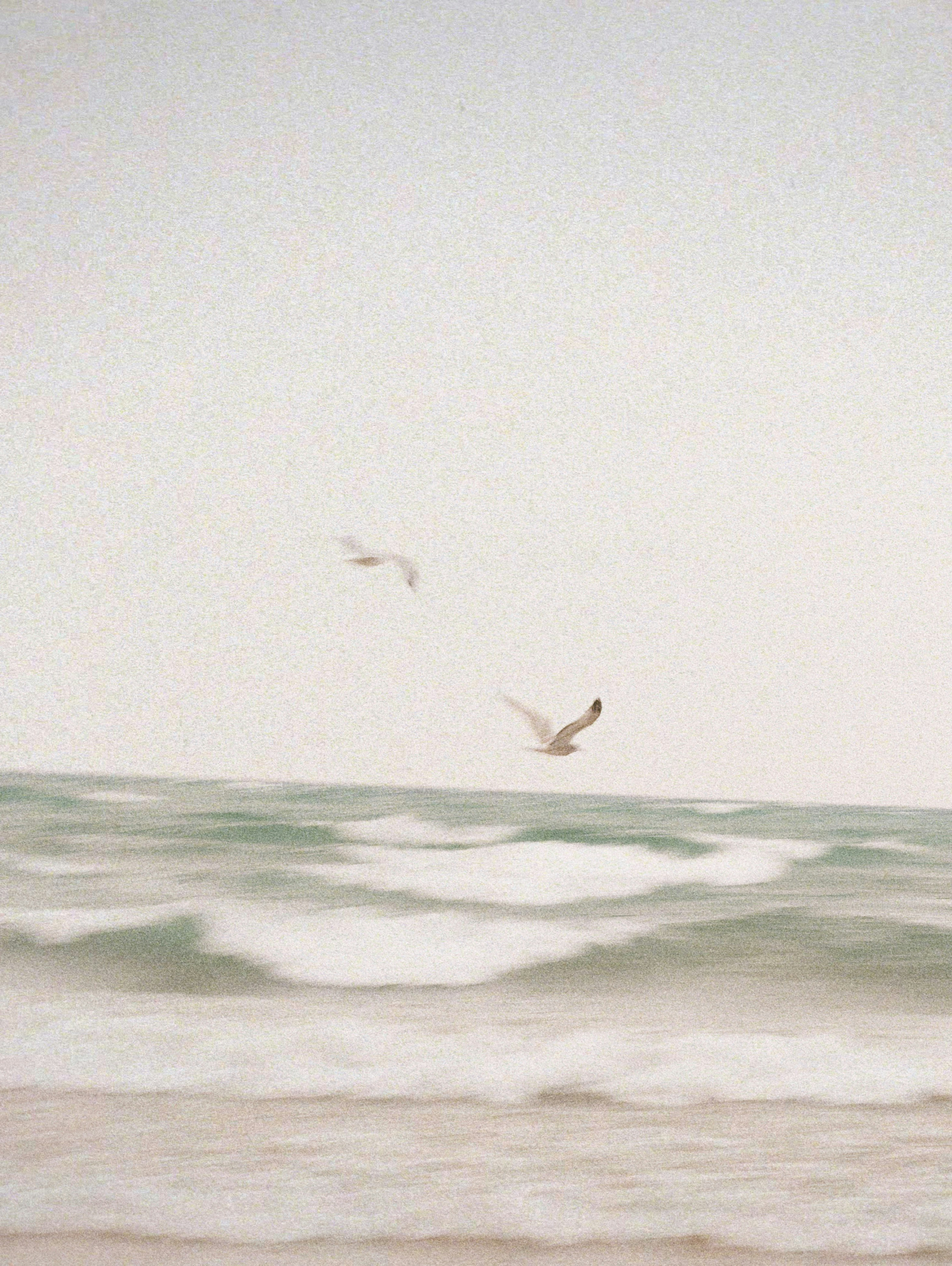
We designed a visual identity that combines the adventurous and the elegant with a nostalgic undertone and realistic, analogue photography with motion blur and long exposure that gives texture to the future memory—the opposite of the destination postcard that anyone can generate today. We also defined a voice and tone platform and a content plan that organises what to say, in what format, and how often. Both the brand identity and the website were built with the understanding that the catalogue could grow.
Results
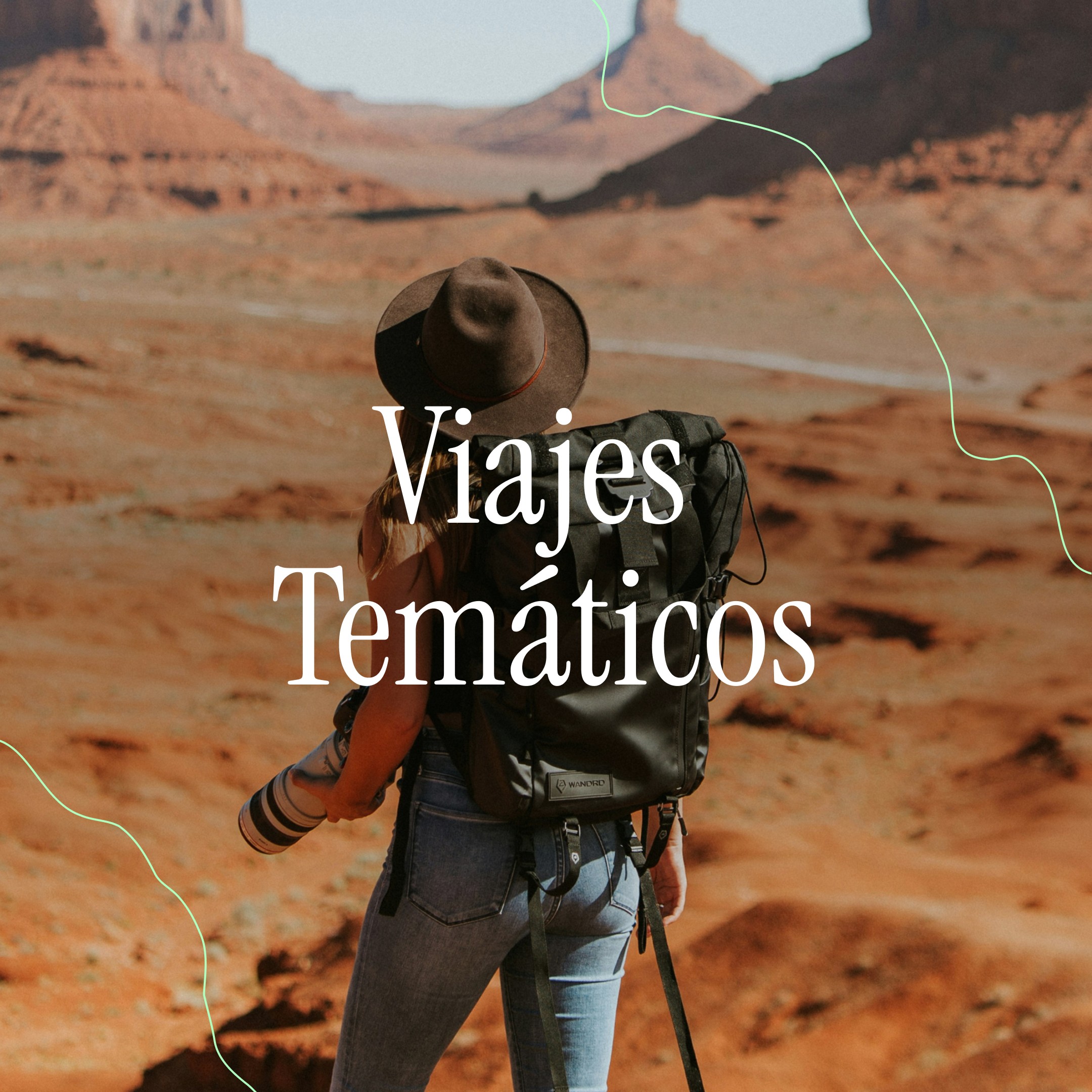
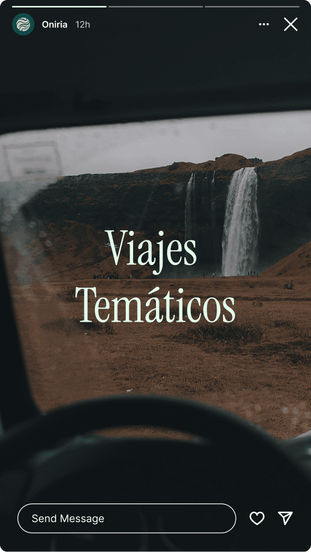
The catalogue grew, indeed, towards long-haul trips and themed trips, and the website had to evolve to absorb the new services in the portfolio. The brand has not needed to be touched, which was exactly what it was designed for.
ANUARIA Selection 2025 for the best logo or brand.
Testimonial
"We have been working with Crater for years, on both branding and website projects. They always do an excellent job, with great attention to detail and responding to our needs immediately. We have always recommended them and will continue to do so."
Claudia Pérez-Íñigo
Co-founder of Oniria and Spacioboda